Building a Shopify store isn’t particularly difficult these days. But building one that consistently generates sales, supports growth, and gives customers a smooth buying experience is where the real work begins.
We’ve worked with businesses launching their first online store and others migrating from platforms that had become difficult to manage. While every project is different, the same challenges tend to appear again and again. Customers struggle to find products, mobile experiences feel clunky, product pages leave important questions unanswered, traffic arrives, but conversions don’t follow. Most of the time, Shopify isn’t the issue.
The difference usually comes down to planning. A successful ecommerce website isn’t just a product catalogue, it’s a sales tool, a customer service channel, and often the first impression people have of a business.
Related Read – Shopify Migration Guide
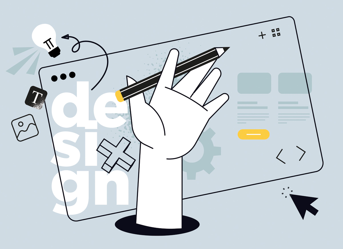
Before Choosing a Theme, Understand the Customer Journey
One of the first conversations in many ecommerce projects is about design. Business owners understandably want to know what the homepage will look like, what colours will be used, and how the brand will be presented online. Those things matter, but they’re rarely the place to start.
The strongest ecommerce stores are usually built around customer behaviour first. Design comes after. Think about how people arrive at an online store. Some discover it through Google. Others click through from social media, online ads, or email campaigns. Most aren’t sitting down with a detailed understanding of your products.
They’re trying to answer a few basic questions:
- Am I in the right place?
- Can I find what I need quickly?
- Does this business look trustworthy?
- Is purchasing going to be straightforward?
If the website answers those questions early, customers are far more likely to continue exploring. The easier it is for people to understand what you’re selling and how to buy it, the better the experience tends to be.
Related Read – Shopify vs Wix
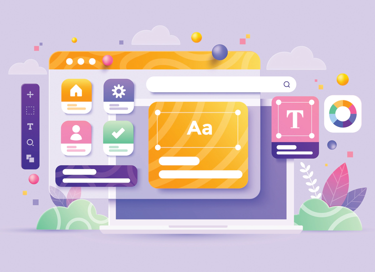
Shopify Themes Look Great in Demos. Real Stores Are Different.
Choosing a Shopify theme can feel overwhelming. There are thousands of options available, and many of them look excellent during demonstrations. Large product imagery, animated sections, and modern layouts can create a strong first impression. The challenge is that demo stores aren’t real stores. Real stores grow – new categories get added, product ranges expand, marketing campaigns bring in different types of visitors. What looked perfect with twelve sample products can feel very different with two hundred.
When reviewing themes, we usually spend less time looking at visual effects and more time looking at practical considerations:
- How does the theme perform on mobile devices?
- Is navigation flexible?
- Can customers filter products easily?
- Does the layout support future growth?
- How quickly do pages load?
You might notice that many successful ecommerce websites are surprisingly simple. That’s because customers usually care more about finding products than admiring design features.
Related Read – Shopify vs WordPress
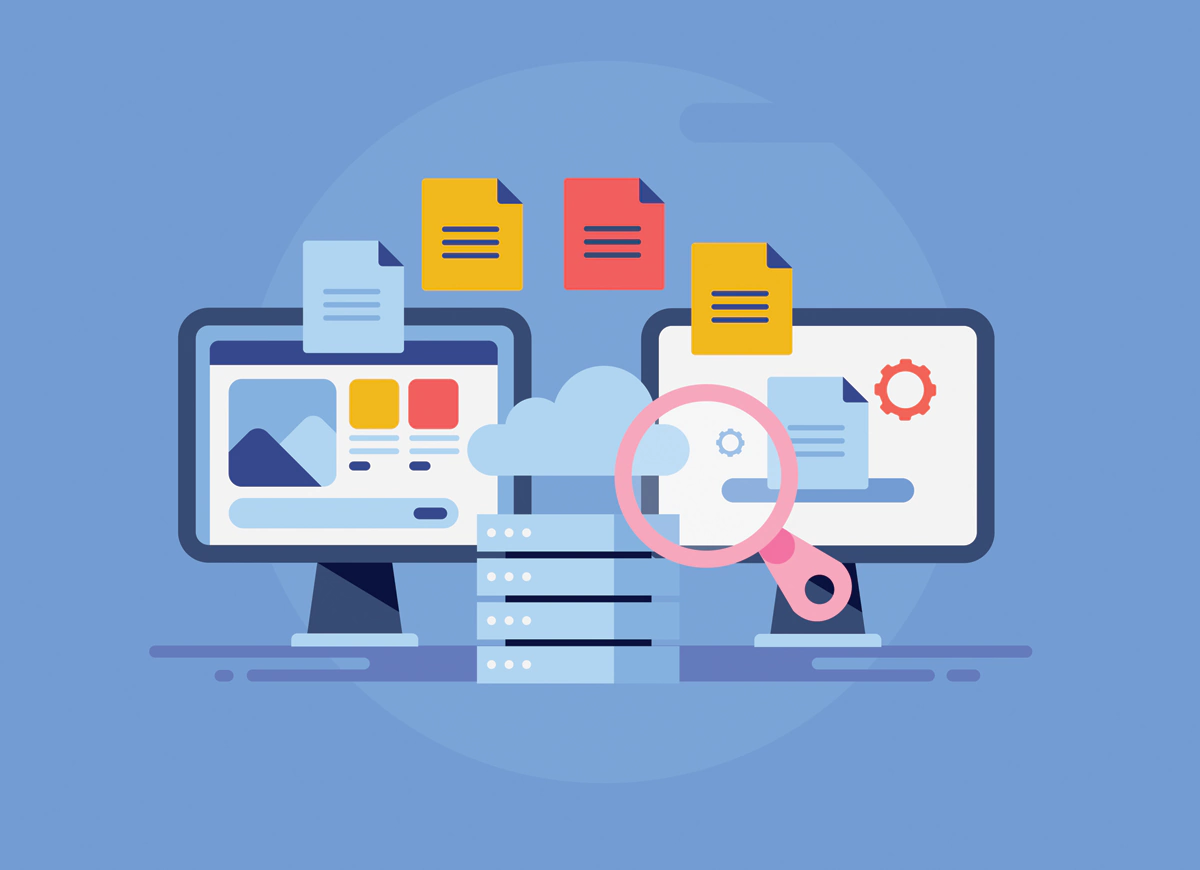
Store Structure Often Determines Whether Customers Stay or Leave
Think about walking into a large retail store with no signage and no obvious product sections. You might spend a few minutes searching, but eventually frustration takes over. Online shoppers are no different.
One thing we’ve found is that businesses often organise products based on internal thinking rather than customer behaviour. It makes sense from the company’s perspective but not necessarily from the customer’s.
Navigation should feel obvious, collections should be logical and search should actually help people find products. For most Shopify stores, that means paying attention to:
- Product categories
- Collections
- Search functionality
- Navigation menus
- Product filtering
These details aren’t particularly exciting, but they have a significant influence on how easily customers can move through the website.
Related Read – Shopify vs. Squarespace vs. WooCommerce
Product Pages Do More Selling Than Most Businesses Realise
We’ve reviewed ecommerce stores where substantial marketing budgets were driving traffic every month, yet product pages were quietly undermining performance. The products themselves weren’t the issue, the information was.
A customer would arrive on a product page and still have unanswered questions. Shipping details were difficult to find, there weren’t enough images or important specifications were missing. Individually, those seem like small problems. Together, they create uncertainty. And uncertainty is rarely good for conversions. Good product pages don’t necessarily need long sales copy, they need useful information.
That often includes:
- Clear product photography
- Specifications
- Shipping details
- Reviews
- Product variations
- Frequently asked questions
Beyond that, context helps. If you’re selling outdoor furniture, customers may want to know how it performs during Australian summers. If you’re selling workwear, durability may be more important than promotional language. The goal isn’t to impress people with marketing, it’s to answer questions before they need to ask them.
Related Read – Shopify vs BigCommerce
Mobile Experience Is No Longer a Separate Consideration
There was a time when businesses could design for desktop first and think about mobile later. That’s no longer realistic. For many ecommerce websites, mobile visitors represent the majority of traffic. What’s interesting is how often small mobile issues create disproportionately large problems.
We’ve seen stores where desktop performance looked excellent, but mobile users were struggling with overlapping menus, slow-loading galleries, and checkout forms that felt awkward to complete. Most customers won’t send feedback explaining why they left, they simply leave. That’s why mobile usability needs to be considered throughout the project rather than during final testing.
Sometimes a small improvement to navigation or page speed can have a bigger impact than a complete homepage redesign.
Related Read – Shopify vs. WooCommerce
Checkout, SEO, and Long-Term Growth
Many businesses focus heavily on getting a store launched. Launch is important, but it’s really the beginning. Once customers start using the website, new opportunities and challenges become visible. Checkout processes can be refined, shipping information can be clarified, product pages can be improved based on customer behaviour.
The same applies to SEO. A common misconception is that SEO begins after development. In reality, many of the foundations are established much earlier through site structure, content planning, page hierarchy, and technical performance. Content can also play a valuable role over time.
We’ve seen buying guides, FAQs, and educational articles become significant sources of traffic because they answer questions customers are already searching for. Growth rarely comes from one major change. More often, it comes from a series of smaller improvements that gradually make the store easier to find and easier to use.
Final Thoughts
The most successful Shopify stores aren’t always the most visually impressive. In many cases, they’re simply the easiest to use. Customers can find products quickly, information is clear, mobile experiences feel smooth and checkout doesn’t create unnecessary friction.
Those things sound simple, but they’re often what separate a high-performing ecommerce store from one that struggles to gain traction.
This is why businesses often work with experienced web design Melbourne professionals like our team at Make My Website when building a Shopify website. Our goal is always to create an ecommerce experience that supports customer behaviour, builds trust, and gives the business room to grow. If you are planning to build a Shopify store and need professional guidance to ensure you proceed right, get in touch with us at Make My Website today.


 1300769302
 info@makemywebsite.com.au