If you’ve ever opened Google Analytics and thought, “Okay… people visited. But what actually happened?”, you’re not alone. Numbers alone rarely explain behaviour. You might see a high bounce rate, a drop in conversions, or users leaving halfway through a page, but analytics dashboards don’t show the moment someone gets confused, frustrated, or simply loses interest.
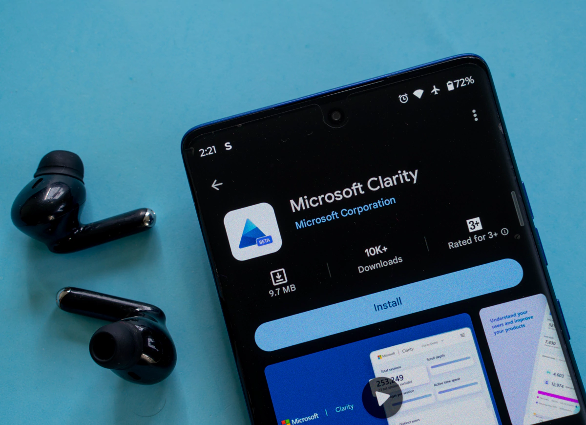
That gap is exactly where Microsoft Clarity comes in. Microsoft Clarity is a free behavioural analytics tool that helps you see how people really use your website. Not just traffic counts or session durations, but real interactions: clicks, scrolling patterns, rage clicks, dead clicks, and full session recordings.
For web design agencies and businesses trying to improve performance, Clarity often becomes less of an analytics tool and more of a diagnostic one. Let’s break it down properly.
What Is Microsoft Clarity?
Microsoft Clarity is a user behaviour analytics platform developed by Microsoft that records how visitors interact with your website. It focuses on visual insights rather than raw data tables.
Instead of guessing why users don’t convert, Clarity shows you:
- Where users click
- How far they scroll
- Which elements they ignore
- Where frustration happens
- How navigation actually unfolds
The platform launched publicly in 2020 and quickly gained traction because it removed a major barrier: cost. Unlike many UX research tools, Clarity is completely free with no traffic limits. That alone made agencies pay attention. But the bigger reason people keep using it is simpler – it answers questions traditional analytics tools struggle with.
Why Traditional Analytics Isn’t Always Enough
Tools like Google Analytics are excellent at tracking performance metrics. You can measure traffic sources, conversions, demographics, and events. What you can’t easily see is behaviour context.
For example:
- A page has a 75% bounce rate
- Conversion dropped after a redesign
- Mobile users abandon checkout more often
Analytics tell you the outcome but it doesn’t show the experience or user journey. Clarity fills that gap by letting you watch anonymous recordings of real sessions. You see hesitation, repeated clicks, sudden exits, or scrolling patterns that suggest confusion. This helps designers discover issues they never expected.
Key Features of Microsoft Clarity
1. Session Recordings
Session recordings are usually the first feature people explore. Clarity records anonymised user sessions so you can watch how visitors move through your website. Mouse movement, scrolling, clicks, and navigation paths are all visible.
You might notice things like:
- Users repeatedly opening and closing menus
- Visitors scrolling quickly past important content
- Forms abandoned halfway through
- Users trying to click non-clickable elements
These recordings remove guesswork. Instead of debating design decisions internally, teams can look at actual behaviour. You can use recordings during redesign audits because they reveal friction points fast.
2. Heatmaps
Heatmaps are visual reports that show how visitors interact with a webpage by using colors to represent user activity. They provide a visual overview of interaction patterns across pages.
Clarity generates three main types:
- Click heatmaps
- Scroll heatmaps
- Area engagement heatmaps
A scroll heatmap, for example, often surprises teams. Content placed halfway down a long page may never be seen by most visitors. You might assume users read everything carefully but in reality, many skim aggressively, especially on mobile. Heatmaps make that visible in seconds.
3. Rage Click and Dead Click Detection
This is one of Clarity’s more practical features. Clarity automatically detects frustration signals such as:
- Rage clicks – repeated rapid clicks in the same area
- Dead clicks – clicks on elements that don’t respond
- Quick backs – users returning immediately to the previous page
These signals usually point to UX problems. For instance, users may think an image is clickable when it isn’t. Or a button may look interactive but fails to load quickly enough.
Instead of waiting for complaints, Clarity surfaces these issues automatically.
4. Smart Insights Dashboard
Clarity summarises behaviour patterns into quick insights. You’ll see metrics like:
- Excessive scrolling
- JavaScript errors affecting users
- Device performance differences
- Browser-specific issues
This helps teams prioritise fixes without manually reviewing hundreds of recordings. It’s not perfect, but it’s useful when traffic volume increases.
5. Privacy-First Tracking
One reason Clarity gained adoption quickly is its privacy approach. Microsoft automatically masks sensitive information such as:
- Password fields
- Personal data inputs
- Secure form information
The platform is GDPR-friendly when configured correctly, which matters for businesses operating in Europe or working with privacy-conscious clients.
Microsoft Clarity vs Google Analytics
A common misconception is that Clarity replaces Google Analytics. It doesn’t as they solve different problems.
| Feature | Google Analytics | Microsoft Clarity |
|---|---|---|
| Traffic measurement | Yes | Limited |
| Behaviour visualization | No | Yes |
| Session recordings | No | Yes |
| Heatmaps | No | Yes |
| Conversion tracking | Strong | Basic |
| Cost | Free (GA4) | Free |
Most agencies run both together. Google Analytics explains what happened and Clarity helps explain why it happened. When combined, they become significantly more powerful.
Real-World Use Cases
Fixing Conversion Drops After a Redesign
A business launches a new website and conversions suddenly fall. Analytics shows lower form submissions, but nothing obvious stands out.
Clarity recordings reveal users scrolling past the contact form because it blends into the page visually. A small design adjustment restores conversions.
Improving Mobile Experience
Mobile traffic may account for 60–70% of visits for many websites today. Yet desktop designs often guide decisions. Clarity frequently shows mobile users struggling with:
- Sticky headers covering content
- Hard-to-tap buttons
- Long forms
- Slow-loading elements
Watching even 10 recordings can reveal issues analytics alone misses.
Identifying Content Blind Spots
Marketing teams sometimes invest heavily in sections users barely see. Heatmaps regularly show engagement concentrated near the top third of pages. That insight changes how content gets structured moving forward.
Benefits for Web Design Agencies
For agencies like our, Clarity isn’t just a reporting tool. Over time, it tends to become part of the everyday workflow as once teams start watching real users interact with a site, it’s difficult to go back to guessing.
Design teams often spend hours discussing layout decisions internally. Someone prefers a larger hero section, someone else wants shorter pages and marketing wants more messaging above the fold. Without behavioural data, those conversations can drag on longer than they should. Clarity changes the tone of those discussions. You stop asking what should work and start noticing what actually happens.
Better Client Conversations
Client feedback can be vague. Most agencies hear some version of:
- “Something feels off.”
- “Users aren’t engaging.”
- “We expected more leads.”
Those statements aren’t wrong, but they aren’t actionable either. When you open a session recording during a meeting, the conversation shifts almost immediately. Clients see users hesitate, they watch someone scroll quickly past an important section. Sometimes you’ll notice a visitor clicking repeatedly on an image expecting it to open something. That moment usually says more than a full analytics report.
In most cases, clients understand visual proof faster than charts or percentages. It removes defensiveness too. Instead of debating opinions, everyone is observing the same behaviour together. And honestly, it saves time. Fewer back-and-forth revisions and fewer redesign requests based purely on preference.
Data-Backed UX Decisions
Design work has always contained a degree of subjectivity. Even experienced designers rely partly on instinct. The problem is that instinct doesn’t scale across industries, audiences, or devices. Clarity introduces friction into assumptions, which is usually a good thing.
You might believe a long-form landing page is too heavy. Recordings may show users scrolling comfortably and engaging with multiple sections or the opposite happens. A page that looks clean internally turns out confusing in real use.
But some variation is normal. Not every user behaves the same way but patterns appear faster than expected once you review enough sessions. Teams begin designing with behaviour in mind rather than aesthetics alone. That doesn’t mean creativity disappears, it just becomes more grounded.
Continuous Improvement Instead of Periodic Redesigns
Many businesses still treat websites like finished products. Launch the site, celebrate, and move on until performance drops years later. In practice, websites behave more like software. They need adjustments constantly.
Clarity supports incremental improvement. Small tweaks based on observation often outperform large redesigns built on assumptions. Moving a button, shortening a form, or simplifying navigation might sound minor, but these changes compound over time.
You might review recordings one week and notice mobile users struggling with a dropdown menu. Fixing that issue could quietly improve conversions without any major design overhaul.
Agencies that adopt this mindset tend to keep clients longer because optimisation becomes ongoing rather than project-based.
Benefits for Marketers and Growth Teams
Design agencies aren’t the only ones gaining value here. Marketing teams often find Clarity surprisingly useful, especially when campaign results don’t match expectations. A campaign might generate strong traffic numbers, yet conversions remain flat. Analytics shows the traffic arrived, but not what happened next. Watching recordings answers questions marketers rarely get clarity on:
- Did users read the headline?
- Did they notice the offer?
- Did they hesitate before clicking?
Sometimes messaging isn’t the issue at all. The layout simply makes the call-to-action easy to miss. In paid advertising, that difference matters. Fixing a landing page can improve results without increasing ad spend. From a budget perspective, that’s usually the easiest win available.
Benefits for Developers and Technical Teams
Developers often approach websites from a functional perspective. If the code works, the assumption is the experience works too. Clarity occasionally proves otherwise.
You might see users encountering layout shifts that only occur on certain screen sizes. Or buttons that technically function but respond slowly enough to cause repeated clicks. These problems rarely appear during internal testing because teams already understand how the interface works. Real users don’t. Another common discovery involves browser-specific behaviour. A feature working perfectly in Chrome might behave differently elsewhere. Clarity surfaces those real-world edge cases without requiring complex debugging setups.
For developers, it becomes less about speculation and more about observation.
How Clarity Changes the Way Teams Think About UX
Something subtle happens after teams use behavioural analytics for a while. They begin thinking less about pages and more about journeys. Instead of asking, “Does this page look good?” the question becomes, “What is the user trying to accomplish here?”
That shift matters.
You start noticing friction earlier during planning stages. Navigation becomes simpler, content hierarchy improves and even copywriting changes because teams understand how quickly people scan rather than read.
In many cases, Clarity doesn’t just improve a website, it changes how teams approach digital decision-making entirely.
Common Mistakes When Using Microsoft Clarity
Despite its usefulness, teams sometimes misuse the tool.
- One common mistake is overreacting to individual sessions. Watching a single confusing interaction can feel dramatic, but isolated behaviour doesn’t always represent broader trends.
- Another mistake is focusing only on negative signals. Rage clicks and dead clicks are helpful, but positive behaviour matters too. Watching successful journeys can reveal what already works well.
- Some teams also spend too much time watching recordings without connecting insights back to measurable goals. Behavioural observation should lead to action, not endless analysis.
In practice, short, focused reviews tend to work best.
Limitations of Microsoft Clarity
No tool solves everything, and Clarity has clear boundaries.
- It doesn’t replace structured analytics platforms. You still need conversion tracking, attribution data, and funnel analysis from tools like GA4.
- Large websites can accumulate thousands of recordings quickly. Without filtering by device, page, or behaviour signals, reviewing data becomes overwhelming.
- There’s also interpretation risk. Two people can watch the same recording and draw slightly different conclusions. That’s normal as behavioural analysis always involves some human judgement.
The key is combining Clarity insights with analytics metrics and business context before making changes.
Best Practices for Getting Maximum Value from Clarity
Teams that benefit most usually follow a few informal habits:
- Review recordings regularly rather than in large batches months later.
- Start with revenue-critical pages first.
- Filter sessions by frustration signals to save time.
- Compare mobile and desktop behaviour separately.
- Document observations before implementing changes.
You don’t need hours each week. Even 20 minutes of focused review often reveals something useful.
Why Behavioural Insight Matters More Than Ever
Digital competition has increased across almost every industry. Most websites already follow similar design patterns, use similar frameworks, and run similar marketing strategies. The difference increasingly comes down to usability.
When visitors encounter friction, they rarely complain, they simply leave. Behavioural analytics helps businesses notice those silent failures. Microsoft Clarity doesn’t magically fix UX problems. What it does is remove uncertainty – you see real behaviour instead of relying purely on assumptions. And once you’ve seen how users actually interact with a site, it becomes very difficult to design blindly again.
Ready to Improve How Your Website Performs?
Understanding user behaviour is only useful when it leads to better decisions. Tools like Microsoft Clarity help reveal what’s happening on your website, but turning those insights into real improvements takes the right design approach.
At Make My Website, we help businesses create websites built around real user behaviour, not assumptions. Whether you’re planning a redesign or simply want better results from your current site, we’re here to help.
If you’re ready to make your website work harder for your business, get in touch with us and let’s start improving it together.
FAQs
1. Is Microsoft Clarity really free to use?
Yes. Microsoft Clarity is completely free, including features like session recordings, heatmaps, and insights. There are currently no traffic limits or paid tiers, which makes it especially attractive for small businesses and startups compared to many analytics tools.
2. How is Microsoft Clarity different from Google Analytics?
Google Analytics focuses on numerical data such as traffic sources, conversions, and user demographics, while Microsoft Clarity focuses on user behavior. Clarity shows how visitors interact with your site through heatmaps, click tracking, and session recordings, helping you understand why users behave a certain way.
3. Does Microsoft Clarity affect website performance?
In most cases, no. Clarity uses a lightweight tracking script designed to have minimal impact on page speed. However, like any tracking tool, performance should be monitored if your site already runs many third-party scripts.
4. Is Microsoft Clarity GDPR-compliant?
Microsoft Clarity includes privacy features such as automatic masking of sensitive data and options to avoid tracking personal information. Website owners are still responsible for proper consent management and compliance with GDPR or other regional privacy laws.
5. Who should use Microsoft Clarity?
Microsoft Clarity is useful for marketers, UX designers, website owners, and e-commerce businesses. Anyone who wants to understand how users navigate, click, scroll, or struggle on a website can benefit from the insights it provides.


 1300769302
 info@makemywebsite.com.au