
Getting to know what visual hierarchy is all fine and great, but the real game is about knowing how to implement those design aspects and structures. The designers whenever presented with a concept always tend to have a similar reaction – “But how do I create it?” The tools used are basically a fragmentation of the various elements of the page into design components. This helps the designer to focus on the respective layouts that need individual attention. Just like an electrician’s toolbox that has essential wires, screws, drill, hammer, etc., similarly, any design uses various tools to become what it is built for.
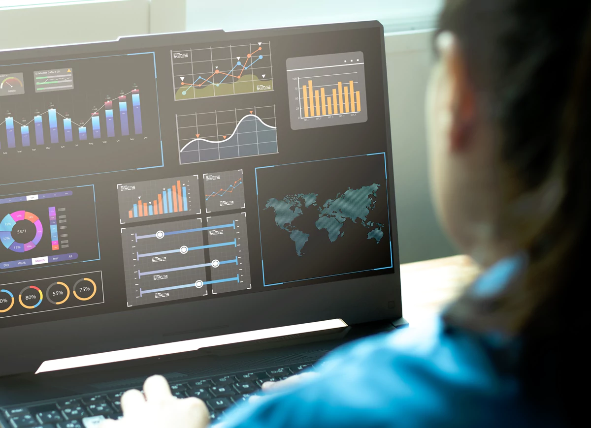
Visual Hierarchy is the arrangement of design elements and their presentation in order of their relevance and priority. Information is of course important but the order and way in which it is presented influences how the human eye captures it and how the brain decodes it. As we are progressing, the human attention span has gone down to 8 seconds, coupled with that the rising competition in terms of design infographics and text, there is a lot a designer has to look into. Keep reading to find out about these tools and how to implement them as design elements:
SIZING
Bigger pictures or texts tend to capture more attention in a design. This aspect of designing can be used to catch eyeballs and bring attention to more important things that need to be highlighted. Size can easily bring the attention of a visitor to the more important portions or spaces of any page. Since Size is the most powerful tool of design it should be used smartly by keeping the most essential components bigger and the least important smaller helping the viewer establish the correlation between size and importance.
The mind ought to be able to easily scan from big elements down to the smaller ones. Big, bold texts sized appropriately help them stand out.
HUES
Who doesn’t get attracted to vibrant hues which makes this is an interesting tool because it can function as a tool to build your website as well as to reinvent your brand. Bold, contrasting colours help capture attention which is why they are widely used for food websites or for brands that have children at the centre of their demographic. Whereas websites that are talking of serious stuff like healthcare or some that need a sophisticated class to their visuals like real estate groups opt for sober, more pastel shades. Since colours have so many associations in our heads, they can easily be used to categorise stuff so it’s easier for your visitor to navigate and get to their page sooner.
Contrasting works amazingly well for the same reasons. A sudden drastic shift in colours or the colour palette brings one to notice that something is unique and requires attention.
ALIGNMENT
Alignment is essentially the placement or order of elements on a given layout. Alignments are used for things like content columns and sidebars which help people navigate things quickly on a given page. Since with alignment come some associations, it is important that they be carefully placed. Like top left alignment is utilized for menu bars or categories, mainly to give a map of the entire page. Whereas the top right side usually gives information on your profile, shopping carts, wishlists, login info, etc. Essentially both the alignment speak of the most important things on a website i.e., the website’s basic layout and visitor’s information.
REPETITION
Repetition of components helps the visitor develop a meaning relative to those elements. If all link text is blue, the moment the user sees another text of the same shade, she can know it’s a link. Whereas if they encounter a different text box or text colour, let’s say the text box in the colour green, they will know the relevance after having seen it multiple times on their screens.
PROXIMITY & DENSITY
Proximity differentiates elements from one another to clearly create subcategories. On a page, various widgets are separated in this way by the space which can further also be used to have different titles, subheadings and the main body of the content. With the right spacing, you can also group text together which might be on different sections of the page altogether.
When elements are packed densely on a page it may feel over-stuffed and chaotic; While when they are very distant from each other, they might lose the context and the connection to each other. A perfectly designed page has elements placed in a way that helps eyes easily recognize and group or differentiate things in context.
TEXTURE & FONTS
The tool that can be most played around and experimented on in the Hierarchists Toolbox, styling can be used to enhance the texture. Solid colour as background would definitely feel different than one a print or shading element. It’s all about knowing what to emphasise and what to let be in a natural look. These elements are very important as they help personify your webpage which is why the designer should experiment with many before finalizing because this is what helps people build their cognitive relationships with different elements on a site.
The style in this way is the riskiest space to play around for the designer as it can easily lead people to distraction from information. This is why it is important to study the nature of your website, your demographic and main goals very intently and thoroughly to be able to deliver a webpage that speaks your language and translates your vision for your brand in the most justifiable way possible!


No comments yet.